
Creating a dialog box with React for a Phaser game
Phaser game UI: Blend canvas and DOM.
Written in October 6, 2021 - 🕒 4 min. readPhaser works by rendering pixels inside a canvas element in the DOM, and it’s great, but one of the great features of web development is the power of the DOM and CSS to create great UI elements, and you can’t do that with Phaser alone.

I recently needed a dialog box for my game, and by Googling “rpg dialog box react” I found a great tutorial by Cameron Tatz on how to create a dialog box using React and react-spring, and that’s exactly what I was looking for.
The original tutorial was using an old version of react-spring, so I updated it and added some other features, which I will show in this tutorial.
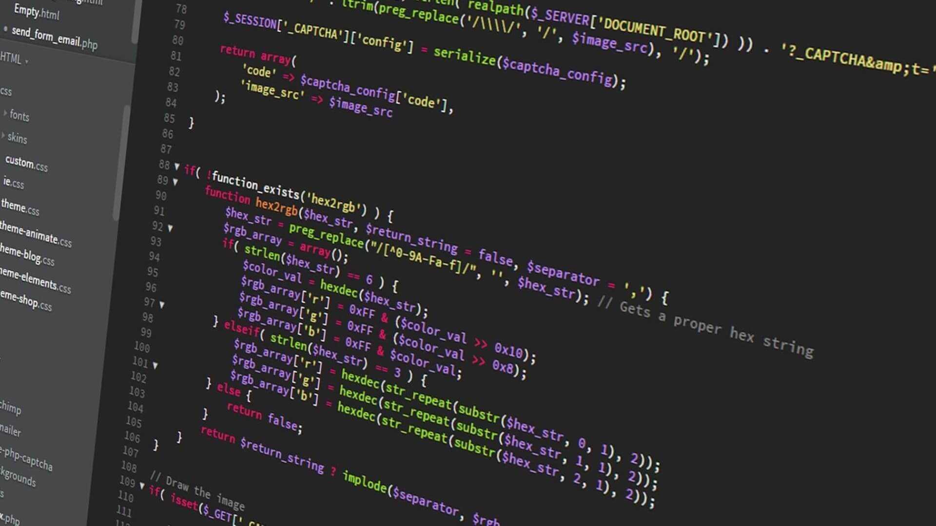
The code
This dialog box will use react-spring to show the message letter by letter. If you press ENTER, it will finish the current message animation and show it in full and if you press ENTER again it will move to the next message if there is one.
The two main changes in the code for the Message.jsx component are that the useTransition API changed to receive just the items and the config object, instead of the items, a mapping function, and the config object.
I also added the onRest property to the useTransition config object to check if the message animation is over. onRest is called after every letter animation, so I need to check for the current letter index.
If the prop forceShowFullMessage is sent, then I will simply show the full message, without any animation.
import React, { useMemo } from 'react';
import { animated, useTransition } from 'react-spring';
import { makeStyles } from '@material-ui/core/styles';

const useStyles = makeStyles((theme) => ({
    dialogMessage: () => ({
        fontSize: '12px',
        textTransform: 'uppercase',
    }),
}));

const Message = ({
    message = [],
    trail = 35,
    onMessageEnded = () => {},
    forceShowFullMessage = false,
}) => {
    const classes = useStyles();
    const items = useMemo(
        () => message.trim().split('').map((letter, index) => ({
            item: letter,
            key: index,
        })),
        [message]
    );

    const transitions = useTransition(items, {
        trail,
        from: { display: 'none' },
        enter: { display: '' },
        onRest: (status, controller, item) => {
            if (item.key === items.length - 1) {
                onMessageEnded();
            }
        },
    });

    return (
        <div className={classes.dialogMessage}>
            {forceShowFullMessage && (
                <span>{message}</span>
            )}
            {!forceShowFullMessage && transitions((styles, { item, key }) => (
                <animated.span key={key} style={styles}>
                    {item}
                </animated.span>
            ))}
        </div>
    );
};

export default Message;
For the DialogBox.jsx component, I’m using a background image very similar to the one in the original tutorial.

This file handles the keyboard interactions for the dialog, so if the player presses ENTER and the message animation is still playing, then it finishes the current animation by setting forceShowFullMessage to true. If the player presses ENTER and the message animation is already finished, then it goes to the next message.
Besides forceShowFullMessage, I also get screenWidth and screenHeight as props, so I can scale up or down the size of the box depending on the size of the Phaser game.
import React, { useCallback, useEffect, useState } from 'react';
import { makeStyles } from '@material-ui/core/styles';
// Images
import dialogBorderBox from '../images/dialog_borderbox.png';
// Components
import Message from './Message';
const useStyles = makeStyles((theme) => ({
dialogWindow: ({ screenWidth, screenHeight }) => {
const messageBoxHeight = Math.ceil(screenHeight / 3.5);
return {
imageRendering: 'pixelated',
textTransform: 'uppercase',
backgroundColor: '#e2b27e',
border: 'solid',
borderImage: `url("${dialogBorderBox}") 6 / 12px 12px 12px 12px stretch`,
padding: '16px',
position: 'absolute',
top: `${Math.ceil(screenHeight - (messageBoxHeight + (messageBoxHeight * 0.1)))}px`,
width: `${Math.ceil(screenWidth * 0.8)}px`,
left: '50%',
transform: 'translate(-50%, 0%)',
minHeight: `${messageBoxHeight}px`,
};
},
dialogTitle: () => ({
fontSize: '16px',
marginBottom: '12px',
fontWeight: 'bold',
}),
dialogFooter: () => ({
fontSize: '16px',
cursor: 'pointer',
textAlign: 'end',
position: 'absolute',
right: '12px',
bottom: '12px',
}),
}));
const DialogBox = ({
messages,
characterName,
onDialogEnded,
screenWidth,
screenHeight,
}) => {
const [currentMessage, setCurrentMessage] = useState(0);
const [messageEnded, setMessageEnded] = useState(false);
const [forceShowFullMessage, setForceShowFullMessage] = useState(false);
const classes = useStyles({
screenWidth,
screenHeight,
});
const handleClick = useCallback(() => {
if (messageEnded) {
setMessageEnded(false);
setForceShowFullMessage(false);
if (currentMessage < messages.length - 1) {
setCurrentMessage(currentMessage + 1);
} else {
setCurrentMessage(0);
onDialogEnded();
}
} else {
setMessageEnded(true);
setForceShowFullMessage(true);
}
}, [currentMessage, messageEnded, messages.length, onDialogEnded]);
useEffect(() => {
const handleKeyPressed = (e) => {
if (['Enter', 'Space', 'Escape'].includes(e.code)) {
handleClick();
}
};
window.addEventListener('keydown', handleKeyPressed);
return () => window.removeEventListener('keydown', handleKeyPressed);
}, [handleClick]);
return (
<div className={classes.dialogWindow}>
<div className={classes.dialogTitle}>
{characterName}
</div>
<Message
action={messages[currentMessage].action}
message={messages[currentMessage].message}
key={currentMessage}
forceShowFullMessage={forceShowFullMessage}
onMessageEnded={() => {
setMessageEnded(true);
}}
/>
<div
onClick={handleClick}
className={classes.dialogFooter}
>
{(currentMessage === messages.length - 1 && messageEnded) ? 'Ok' : 'Next'}
</div>
</div>
);
};
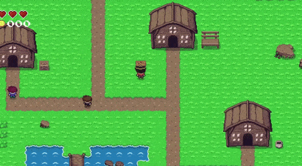
export default DialogBox;And this will be the end result
If you want to know more details about how to integrate Phaser and React, check this blog post.
Tags:
Related posts
Post a comment
Comments
Flo on 11/19/21
Nice Post! One question though: How would you implement a box with two or more texts like a monologue of a npc? So if you press enter a second textbox appears? Thanks in advance